
Webinar Setup Wizard
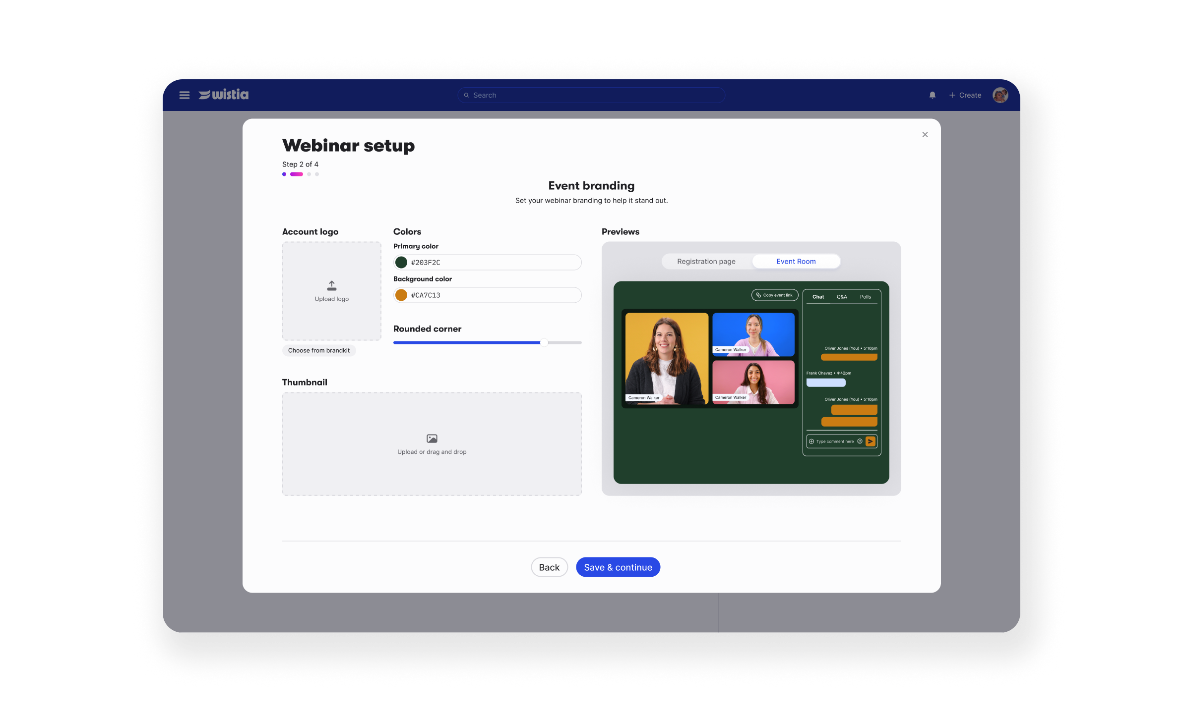
Overview
Webinar setup at Wistia was a flow people started and quietly walked away from. I audited it, broke it down to the four things a host actually needs, and rebuilt it as a guided wizard. Webinars hosted roughly doubled, and the pattern went on to become the template for setup flows across the product.
Impacts:
+60% first webinars created
+45% returning events (creating second webinars)
+63% registration form customizations among trialers
~2x webinars created and hosted, year over year
What I did: Ran the audit and competitive analysis that defined the problem, then owned the IA, UX and UI from lo-fi to ship. Built a working prototype in Replit to get the Webinar and Onboarding teams on the same page, led QA, and designed the follow-up releases.
Team & time: sole designer with a PM and engineers, partnering with the Webinar team · May–Dec 2025
User problem
New hosts opened the setup page, saw twenty-some options with no hint of which ones mattered, and told themselves they'd finish it later. Most never did.
Business problem
Webinars are one of Wistia's main upgrade paths, but the value only shows up once someone actually hosts. We were seeing plenty of events created and far fewer ready to go live, which meant weak adoption, lower trial conversion and early churn.
Key stage 1: Reframing the problem with an audit
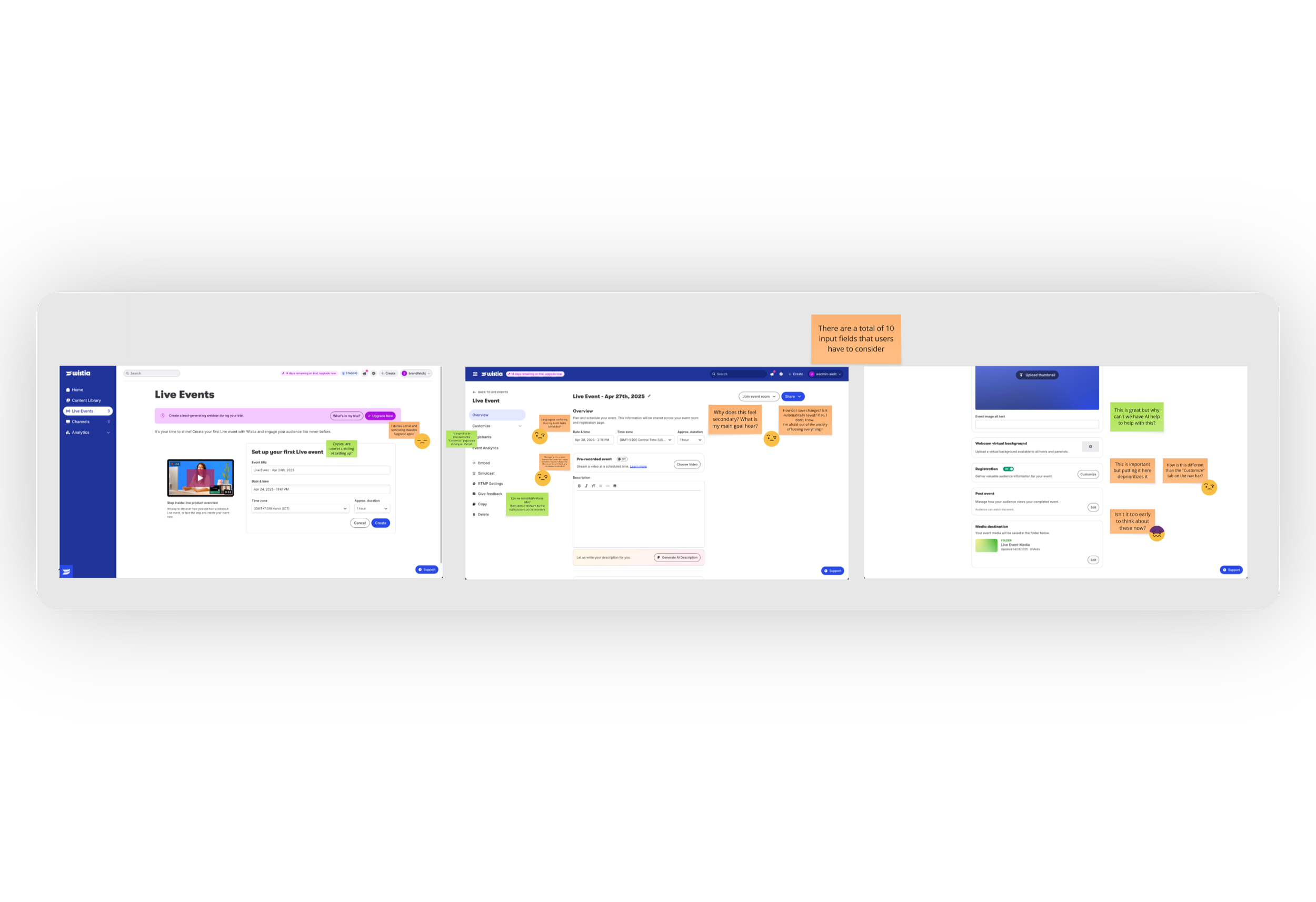
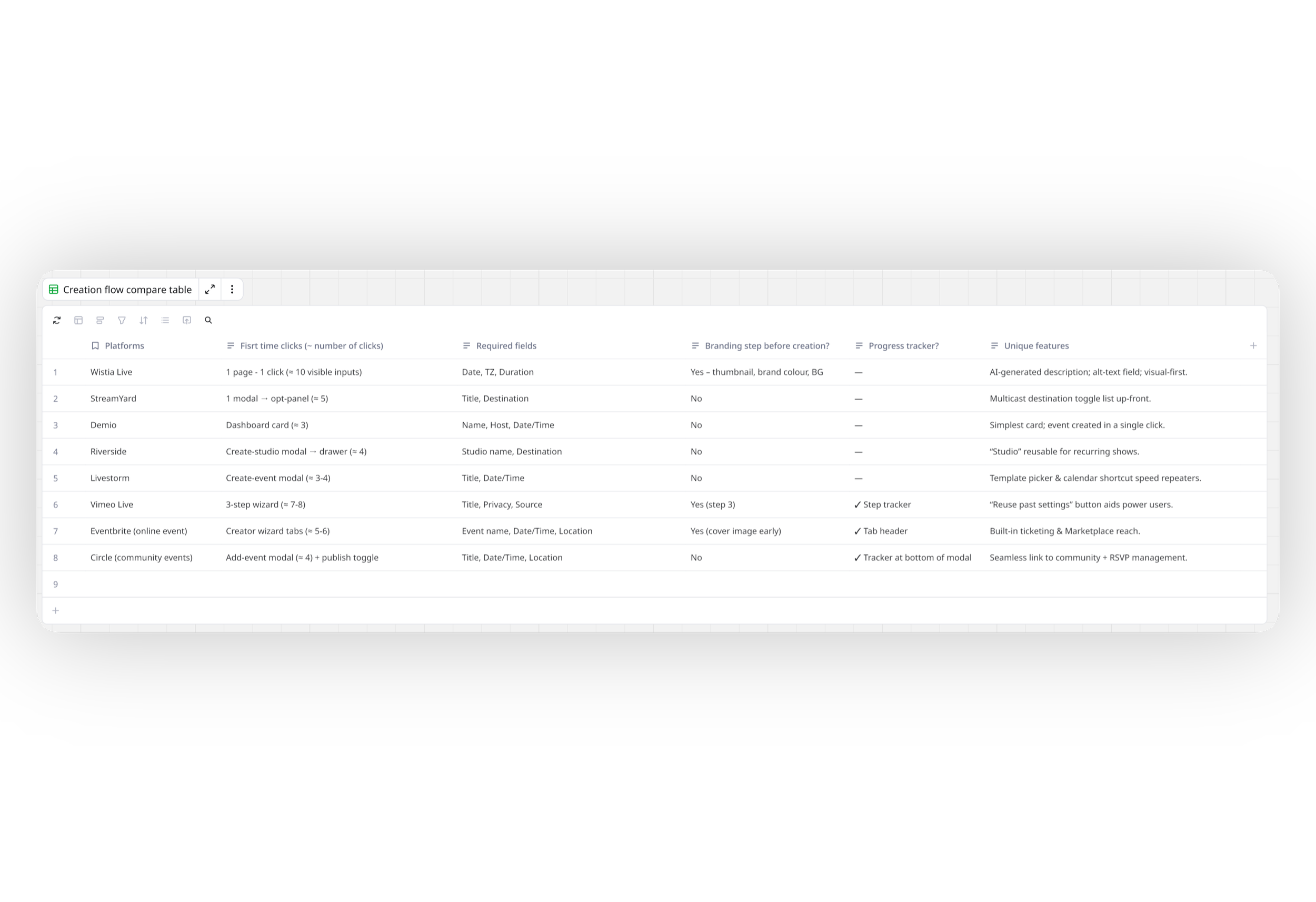
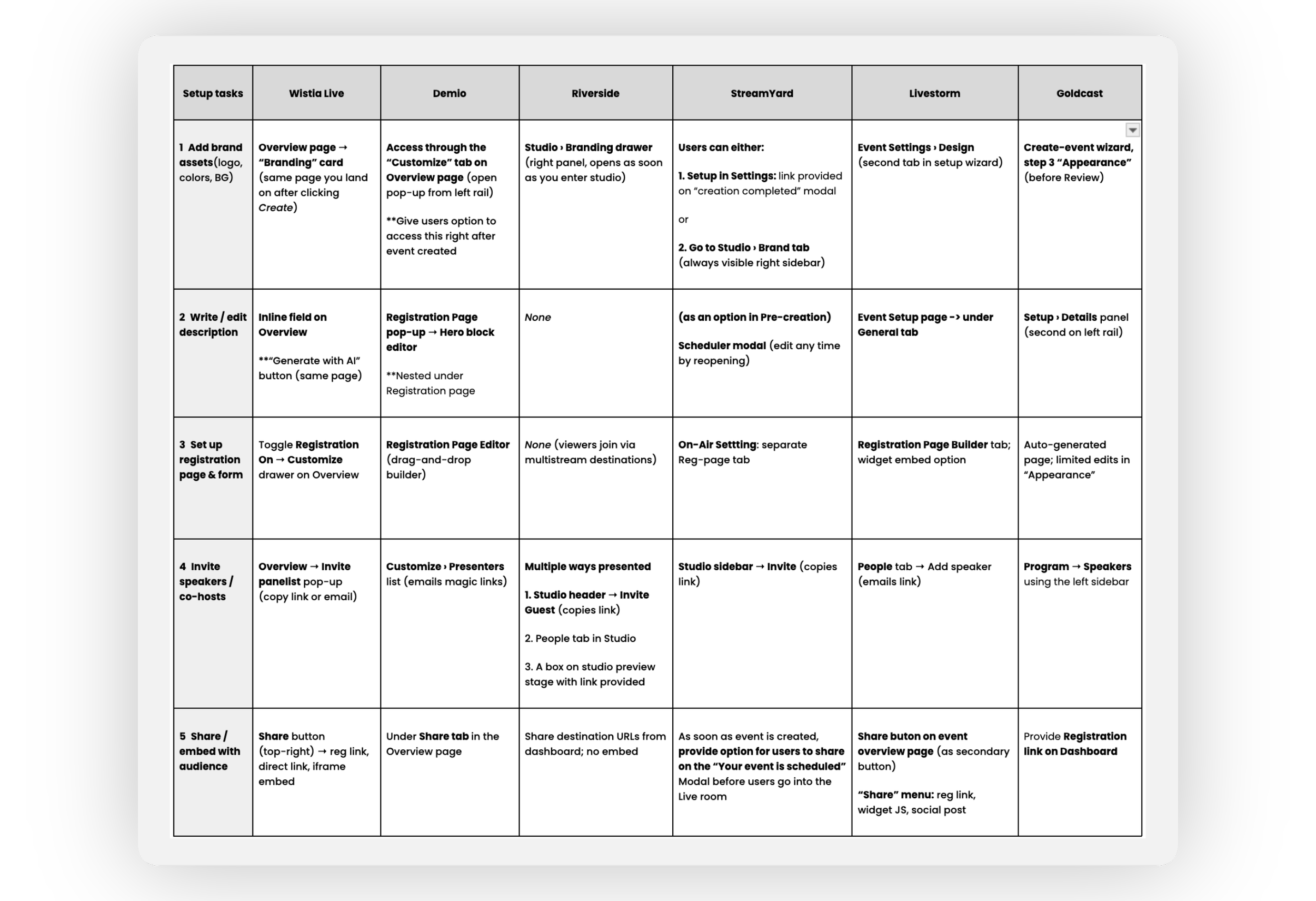
I started with an audit of our own creation flow and then did the same for nine competitors, direct and indirect, to see how they handled the same job. The pattern was hard to miss:
Creating an event and setting it up were two separate journeys
In Wistia, the important steps looked identical to the optional ones
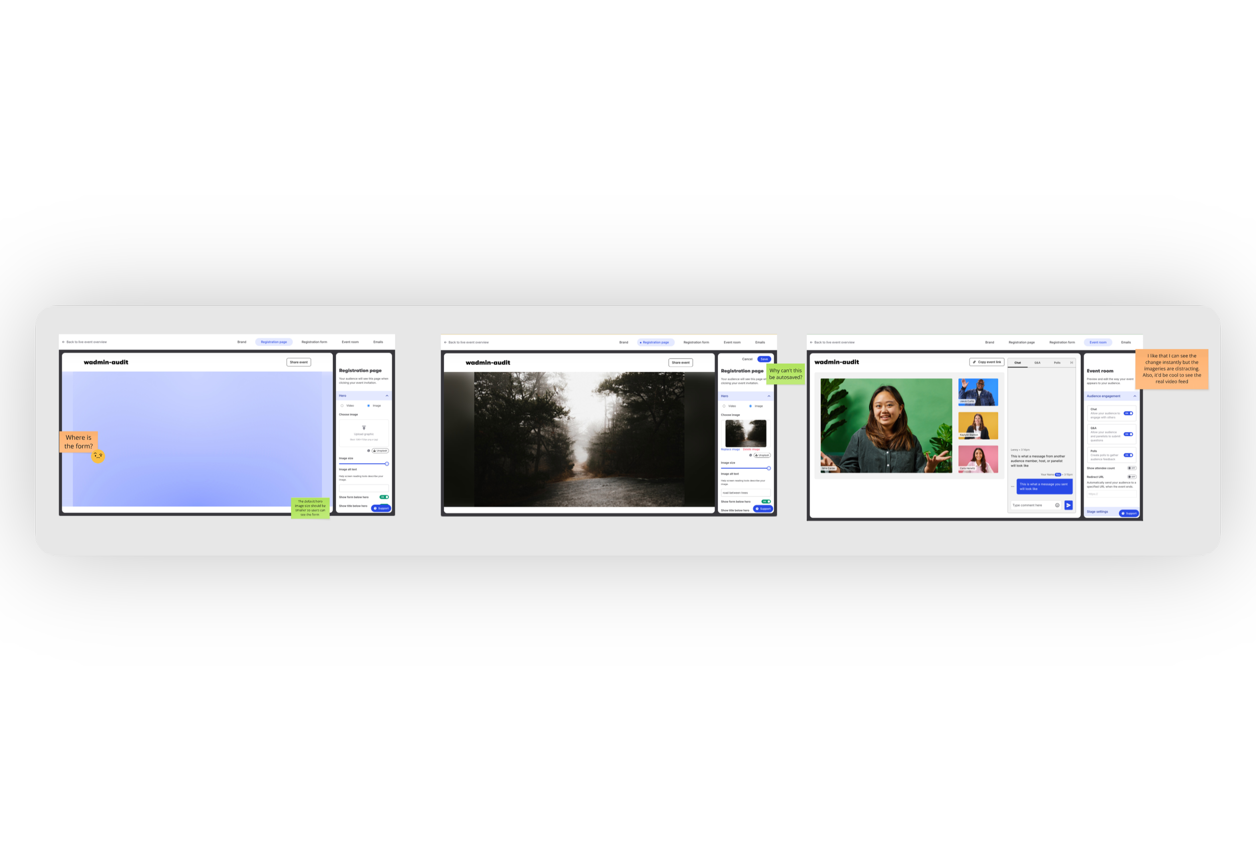
Branding had no immediate previews
Customizations, registration and audience engagement features were buried
Once it was written down that way, the user problem became obvious: "I want to go live, but I can't tell what's essential, so I keep putting it off." That framing got the work onto Growth's T2 2025 roadmap, with me owning the IA and UX.
Key stage 2: Deciding what's essential
I went through 10+ setup options and 20+ customizations and sorted each one into must-have or nice-to-have. After a few rounds with the team, those boiled down to four groups:
Core Logistic:
Event types, Title, Date/time zone, Event description
Brand essentials:
Thumbnail, Logo, Brand colors
Audience access:
Registration page setup, MAP integration (added at later stage)
Audience engagement
Chat, Q&A, Polls
— Progress indicator iterations —
Other key decisions and Tradeoffs:
The event is created as soon as someone clicks Create, so progress isn’t lost.
Smart defaults do the work: brand colors come from the brand kit, the Wistia form is pre-selected, and chat, Q&A and polls are on.
MAP setup was removed at first due to technical constraint, then restored for 2 main tools (Marketo & Hubspot) per popular demand.
Email settings and simulcast were dropped from the wizard because they would only affect a minority of users.
Key stage 3: Making the hidden visible
In the old flow, people often didn't realize they could see what their registration page or event room looked like before going live. So I put a live preview next to every branding and registration step. Pick a color, see it on the event room. Change the form, see it on the registration page.
For accounts that already had a marketing automation integration, I teamed up with the Webinar team's designer on a registration variant that surfaces their Marketo or Pardot lists right there, so nobody has to leave the wizard to wire it up.
Key stage 4: Ship without A/B test, then iterate
With about 70 new webinar signups a month, an A/B test would have taken forever to read. So we flipped the rollout from "new users only" to everyone and leaned on QA and quick follow-ups instead.
Cross-team QA caught a dual-scroll problem in the preview and a confusing MAP form selection. After launch, I refreshed the registration step, consolidated the headers that were pushing content off small laptop screens, and added a way to relaunch the wizard from the overview page for anyone who had closed it too early.
Outcome - What worked
Shipped December 9, 2025. In the first ten weeks compared with the period before launch:
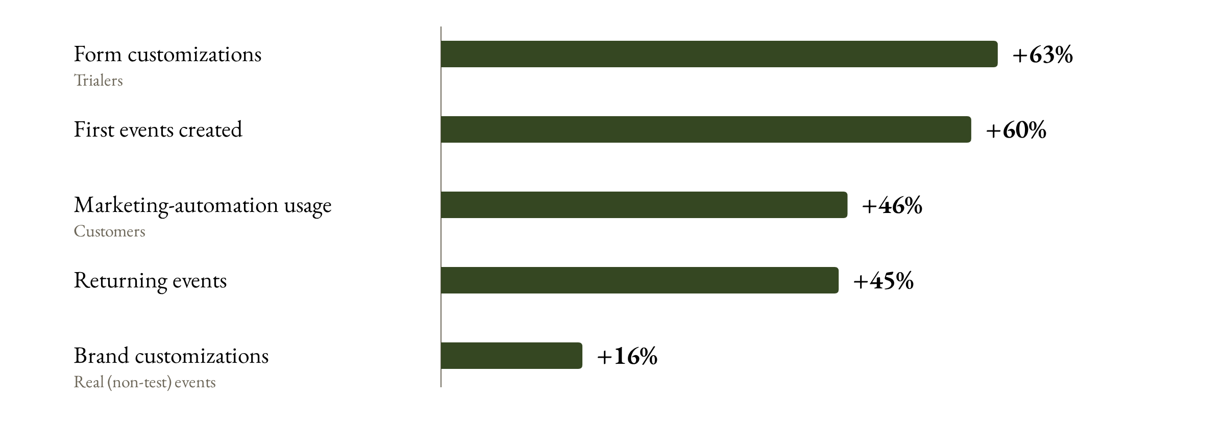
First events created up 60%, returning events up 45%
Brand customizations up 16% for hosted events, form customizations up 63% for trialers
MAP usage (forms + lists) up 46% for customers, with over 500 events using a custom integration in January for the first time
By mid-2026, real webinars created and hosted had roughly doubled year over year (~+105% in Q1), and anyone who reached step two had an 83% chance of finishing all four steps.
The channel and playlist setup flow was later modeled on it.
What to keep in mind
This was a before/after read, not a randomized test. The Webinar team shipped overview-page improvements in the same window, so I think of the wizard as a big contributor to the lift, not the whole story.
Learnings & next steps
The audit was the real deliverable. Writing the problem down myself is what turned a vague complaint into a project I owned. It's how I'd start any messy flow again.
People will take a good default over a choice almost every time. The biggest wins came from what hosts no longer had to decide.
Setup isn't the finish line. Creation went up, hosting didn't climb as fast. That led straight to my next project: a sample completed webinar and a guided tour that shows trialers what a finished webinar looks like. The tour roughly doubled first-time hosts' Webinars Plus trial starts, from 2% to 5%.