
Meetup

PROJECT OVERVIEW
This is a personal project that spanned over the timeline of 2 weeks. The main tasks were to identify flaws, redesign and improve UX/UI of the Meetup mobile app.
Meetup is a platform for finding and building local communities. People use Meetup to meet new people, learn new things, find support, get out of their comfort zones, and pursue their passions, together.
BASICS
Duration: 2 weeks
Team: Solo
Deliverables: Hi-fi mockups, Interactive prototype
Tools: Sketch, Invision Studio, Photoshop
APP ANALYSIS

Starting off the project, I decided to spend a couple of days exploring and analyzing the current app. I paid close attention to the interactions, functionality, information hierarchy as well as visual assets. Below are the main observations:
Functionality of the calendar on the Home page causes confusion.
Double search bars with similar functionality on the Explore screen cause conflicts in UX.
Functionality of the “+” button on card are unclear.
There is no differentiation between group and event card styles.
Limited time-based filters on Explore screen.
Branded photography is not utilized.
WIREFRAMES
Based on research and consultation with a few users, I was able to wireframe the solutions to the problems mentioned above:
Home Screen & Explore Screen were combined to decrease number of tabs.
Two search bars were also consolidated into one.
Calendar was pulled out of the Home Screen and put under the main navigation because this functionality was categorized as secondary and shouldn’t be the prominent feature that users see first.
Different styles were used for different types of cards: Category, Groups and Events.
Floating Button solution was used as the main navigation button.
VISUAL EXPLORATION
Meetup had a major rebranding in late 2019 with the new identity that conveyed their young and eccentric energy. The new identity came with a set of super fun & quirky photography from which I was able to draw some inspirations.
MOOD BOARD
Stemming from the visual inspirations, I created a mood board that served as a direction for the visual treatment of this exercise. The mood board aims to provide a visual guide for when UI is applied to the wireframes. The tone it set is to be playful, dynamic and fluid which directly reflects the main characteristics of the Meetup brand.
APPLYING VISUAL
Creating an on-brand experience
By bringing in the visual characteristic of the brand into the UI, the whole experience of the app shifted from merely serving its purpose to bringing a joyful journey to its users. The playful and energetic color scheme along side with the innovative UI elements serve as a catalyst that will bring forth users’ curiosity as well as their inner explorer selves.

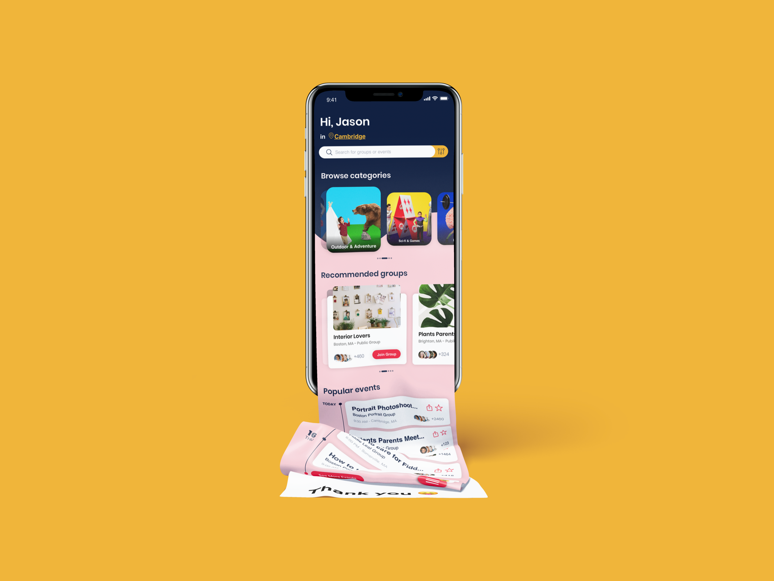
Homexplore Page
The Home page now becomes a Home/Explore page with branded category photography prominently display to visually attract interactions. Search bar is brought front and above to bring easy access to one of the main functionalities of the app.
Floating Main Navigation
The FAB (Floating Action Button) was used to nest the main navigation of the app. With such decision, more real estate was allocated to the main screen.

Calendar, Category and more
Taking the branded visual a step further, I applied it to the other screen with the same guidance in mind, fluid and playful feel.

Category Page
The branded photography was utilized and placed prominently at the top of the page to bring in interest. Sub-categories are placed under title in form of tappable filter buttons.
Activated Search Bar
Once tapping on the search bar from the
Homexplore screen, users will be directed to a full page dedicated for the Search function. From here, they can type in the keywords, pick a time frame as well as location desired for their search.

Calendar view modes
With Monthly view and Timeline view modes, the users can toggle between the two style easily; this gives them the control over the display as well as brings about the flexibility in terms of visual hierarchy.


PROTOTYPE
© Jason Ma