
Hydrow
THE HYDROW
Live Outdoor Reality™
Hydrow is a Live Outdoor Reality™ at-home rowing machine with live and on-demand rows featuring world-class athletes.
Started as a crowdfunding campaign in 2017, Hydrow is sold as a full-body workout coupled with an immersive experience (Hydrow Software) that takes you on waterways around the world.
Features include live rows as well as access to a library of workouts, a social feed with a friends list to help you to stay in touch with the Hydrow community, progress tracking, milestones and achievements, workout history, and more.
HYDROW COMPANION APP
An enhanced experience
The Hydrow App allows members to take workouts on-the-go, interact with the community, track your progress, and more.
Features include a huge library of on-demand classes on the go, social feed to follow and track friends progresses, bookmark live workouts, track their progress, and more.
DESIGN PHILOSOPHY
At its core, Hydrow Product Team always aims to preserve and enhance the principles of user-centered design. We also aspire to create a truly unique, immersive experience of a 'fitness journey' that matches those values of the hardware.
To achieve such goal, collaboration and cross-functional team support play a crucial part in every development cycle. And for that, I personally had multiple opportunities to amplify not only my design skills but also to develop a deeply collaborative and iterative mindset in Product Design.
PROJECT 1: USER PERSONA REVISION
Designers: Razmig Getzoyan, Jason Ma
Manager: Non Watchirajindakul (Product Director)
Collaborators: Marketing, Customer Supports
Duration: 3 weeks
My responsibilities: User interviews, analyzing feedbacks, internal team interviews, constructing persona.
User Research
In the pre-launching days, the Hydrow user persona was created based mostly on market research and subjective assumptions. Though, in the post-launching world with a rapid increase number of Hydrow units used, we realized the need to revisit our user persona. The details of the existing one no longer matched the problems and needs of our real users.
Due to the uniqueness of our product and time constraints, the traditional UX Research strategy was creatively improvised to a non-linear process. Meaning, it involved the design team to continuously use customers’ feedback to review, question, and improve our initial assumptions at different steps through our design cycles.
The main method used for this step was email survey and followed up by individual phone interviews to collect both quantitative and qualitative data. Feedback was also gathered from Customer Supports Team and Sale/Marketing Team for a more holistic perspective.
One of the surveys we sent out to customers to collect data
Hydrow user persona, Dana Love
PROJECT 2: LANDING SCREEN RE-DESIGN
Designers: Razmig Getzoyan, Jason Ma
Manager: Non Watchirajindakul (Product Director)
Collaborators: Engineer Leads, Marketing, Copywriter
Duration: 4 months
My responsibilities: User interviews, competitive analysis, lead design exercise sessions, UI iterations, mockup, prototype, user testing.
THE PROBLEM
An underperforming feature
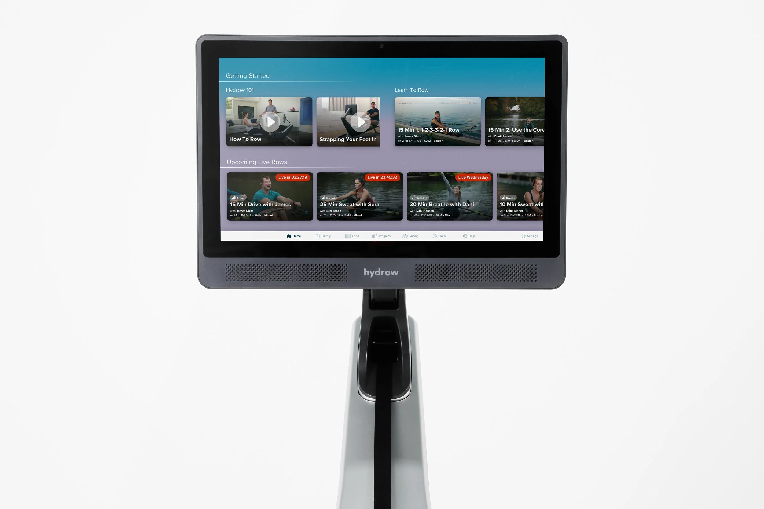
The landing screen (previously called ROWS) is the first page that users land on after logging in to their personal accounts. Although the “Featured” workout is expected to be most utilized, the datas shows us an underwhelming number of users would choose the featured workout to do and that people would spend very little time on this particular section of the screen. Thus, we suspect that this feature is adding very little to the experience of the users and requires a redesign.
The original ROWS Screen
SEARCHING FOR THE ROOT CAUSE
With the help from Engineering and Data Analytical teams, we were able to identify a group of users who either stopped using the Hydrow after a few workouts or those who didn’t utilize the top section of the Rows screen more than twice.
We then decided to schedule phone calls as well as virtual face to face interviews to talk to them hoping to capture the real pain points and the reasons that caused the churning as well as the underutilization of our feature. We soon learned that people weren’t interested in using the Featured workout or the Hydrow altogether mainly because:
They were overwhelmed by the choices provided on the landing screen.
Visually, the Feature section is not interesting and intriguing enough to catch their attentions.
Churning was mainly caused by personal circumstances and a few were by the lack of variations in the workouts.
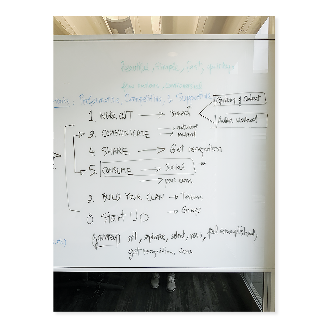
White boarding was one of commonly used practices for ideation and team communication
TAKING SMALL STEPS
The least invasive approach
Once we grew to understand our users’ mental model as well as the problems, it was time for ideation. But before we could full-on spend our time and energy redesigning the whole entire page, we had to take into consideration of the technical capacity as well as the time constraint.
Having a strong relationship with the Product Management team, I also contributed in structuring the roadmap that would affect the runway for this project. After some assessments, the decision was to optimize the “Featured” section with the least invasive approach for the time being.
Following a few quick iterations, we landed on these following revisions:
Converting the previously just an info section into a workout tile with prominent thumbnail image to attract more attentions.
Decreasing the size of the other tiles on this screen to give a slight visual advantage to the one on top.
Changing “Featured” into “Recommended for you” to elevate the personalization aspect of the software.
MAKING THE BIG MOVE
Involving Stakeholders
Shortly after the implementation of the above update, the technical runway opened up; and so came the opportunity to take this project to the next level.
We started off with a rather unique approach. Because we already knew and understood the needs of the users regarding this screen, we realized what we were missing was the perspective of the person who created Hydrow, our CEO Bruce Smith. Though fully understanding the vision and the mission of the company, we saw the need of having a private conversation with him in order to truly transcend his vision into this feature.
So we scheduled a team outing/team design brainstorm session with Bruce and the Director of Product. And the result was very intriguing.
A few of many poster boards we used to brainstorm
Sit, Tap, Row
We learned multiple valuable keys from the design session with our stakeholders:
Hydrow is not just a fitness company, we also benefit from being a streaming service (think Netflix, Hulu, etc)
The landing screen should be purpose-driven, personalized and immersive.
The mood should be fun, organic, inviting and dynamic.
“Our users should be able to just sit down, tap once and row” - Bruce Smith, CEO.
The bold proposal
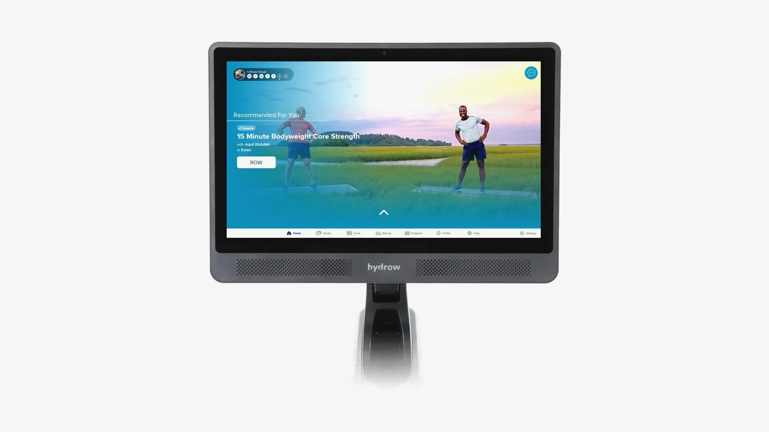
Inspired by the takeaways from the design exercise, I proposed to the team an unprecedented approach. After auditing the existing screen, competitive analyzing, fine-tooth combing the requirements as well as deeply re-interpreting the pain points from the users, I saw the need of making the “Recommended for you” workout overflows the entire screens. And the reasons being:
To declutter the page by removing the options; thus eliminating the paradox of choices that most users encountered.
To utilize our beautiful photography resources to cover the whole entire screen brings in the immersive experience.
To make one and only CTA button prominent and hard to miss, helping the “Sit, tap, row” model.
The earliest rough sketch of the revised landing screen and the tasks delegation.
DESIGN ITERATIONS
Because our product is heavily dependent on the visuals, I decided to skip the wireframes step and spring right into the hi-fi mockup stage. It was the right decision as the visuals (colors, photography, etc) spared the stakeholders the need to “imagine”.
Below are the 2 versions that stood out from the crowd.
Version 1: Kept the “Filter” CTA for access to workout library. Added scroll indicator at the bottom to indicate scrollability.
Version 2: Relocated the menu bar to the left edge. Proposed adding new functional sections below the fold. Bring up part of the contents to indicate scrollability.
USER TESTINGS
After getting approval from the team, I started user testing the design through multiple channels
Head of the Charles Regatta
User data was gathered through a combination of channels but one of the most helpful and insightful ones was letting people interact with the design at HOCR event. Most of people we tested with were Hydrow owners and fell under our main user personas
Other channels
We also invited members to on-site and/or digital interviews. We’d ask them to use the Hydrow units in our studio, perform specific tasks then observed and annotated. Other methods include asking members for video submissions and email surveys.
When conditions permitted, we invited customers to visit our studio and observe their interaction with the Hydrow
THE FEEDBACK
Overall, version 1 won completely over version 2 because people didn’t like the side menu panel on the left; they also didn’t like the sneak peak of what’s below the fold as most stated them being distracting.
On version 1, though almost everyone liked the clean and simple look:
Some did miss the chevron on the bottom indicating that the screen is scrollable
Most didn’t know how to access the library of workouts (by tapping Filter)
Some wished to have a snippet of their progress as well as their avatar on this screen (more personalized experience)
FINAL ITERATION
Taking the feedback and technical constraints into considerations, I was able to land with the final iteration of this project. The changes made were:
Re-skin the bottom navigation for a more on-brand experience
Added the “Library” tab for easier access to workouts.
Increased the size of the scroll indicator for more visibility
Added “Weekly Streak” capsule for more personalization.
THE FULL EXPERIENCE
Below the fold
As stated, the proposal of adding curated buckets of content below the fold was also approved. But due to the time constraint, the whole screen needed to be built out in 2 phases as the picture below depicted.
From left to right: 1) Above the fold. 2) Phase One. 3) Phase Two
THE CHERRY ON TOP
To bring in even more immersive and unique experience, the teams tried to push the boundary by bringing a dynamic loop video as the background instead of just a static image. We also animated the scrolling indicator for visual attention.
Press the play button to experience
THE METRICS
What worked?
60% increase in returning rowers.
We saw a decrease of 25% of churning members.
Numerous compliments from our ZenDesk feedback forms on the new immersive experience comparing to the old world.
What didn’t quite work?
~40% of our members don’t utilize the sections below the fold on this screen.
Further studies and tests need to be conducted to check whether the hesitation on tapping those sections was because people don’t know this page is scrollable or they are not interested in what’s being offered.
PROJECT 3: HYDROW DESIGN SYSTEM
As the early days of Hydrow, the Design system of Hydrow was non-existent. And as the team grew, so did the need for a design source of truth.
Designer: Jason Ma
Manager: Non Watchirajindakul (Product Director)
Collaborators: Engineers across platforms
Duration: Ongoing
My responsibilities: Design audit, UI research, technical interviews with engineers, create and maintain UI library on both Sketch and Zeplin.
An ongoing project
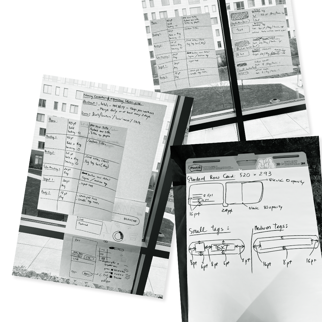
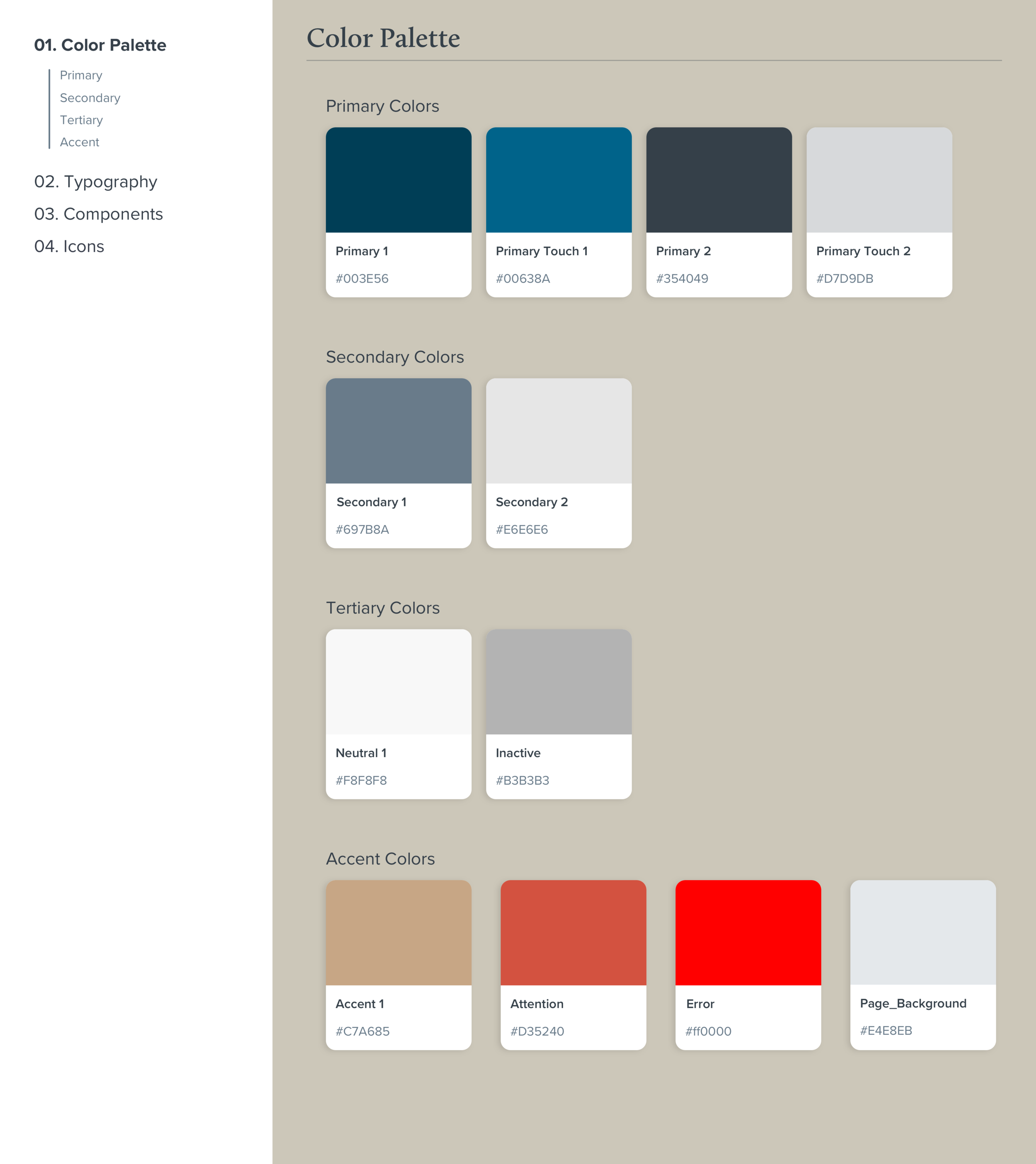
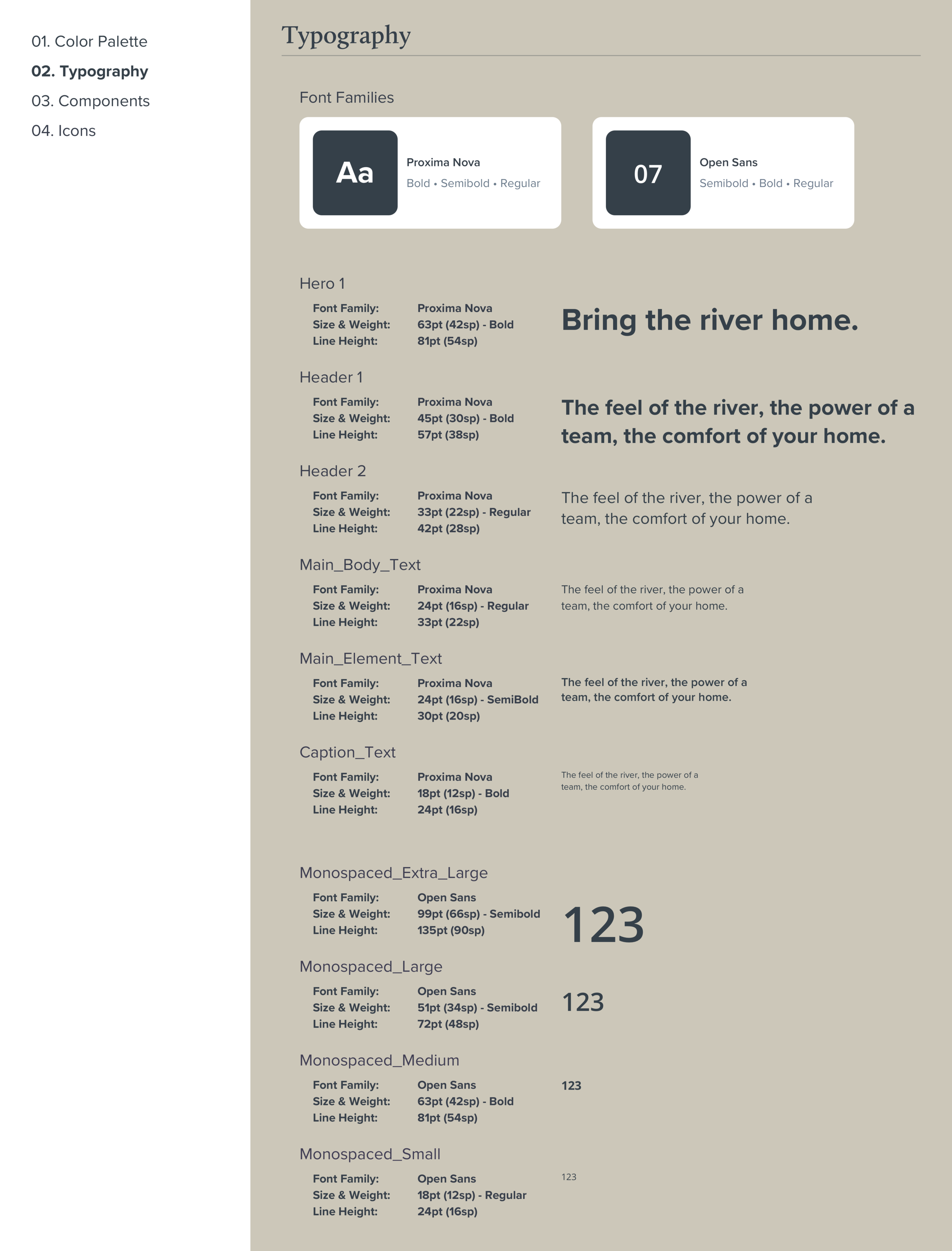
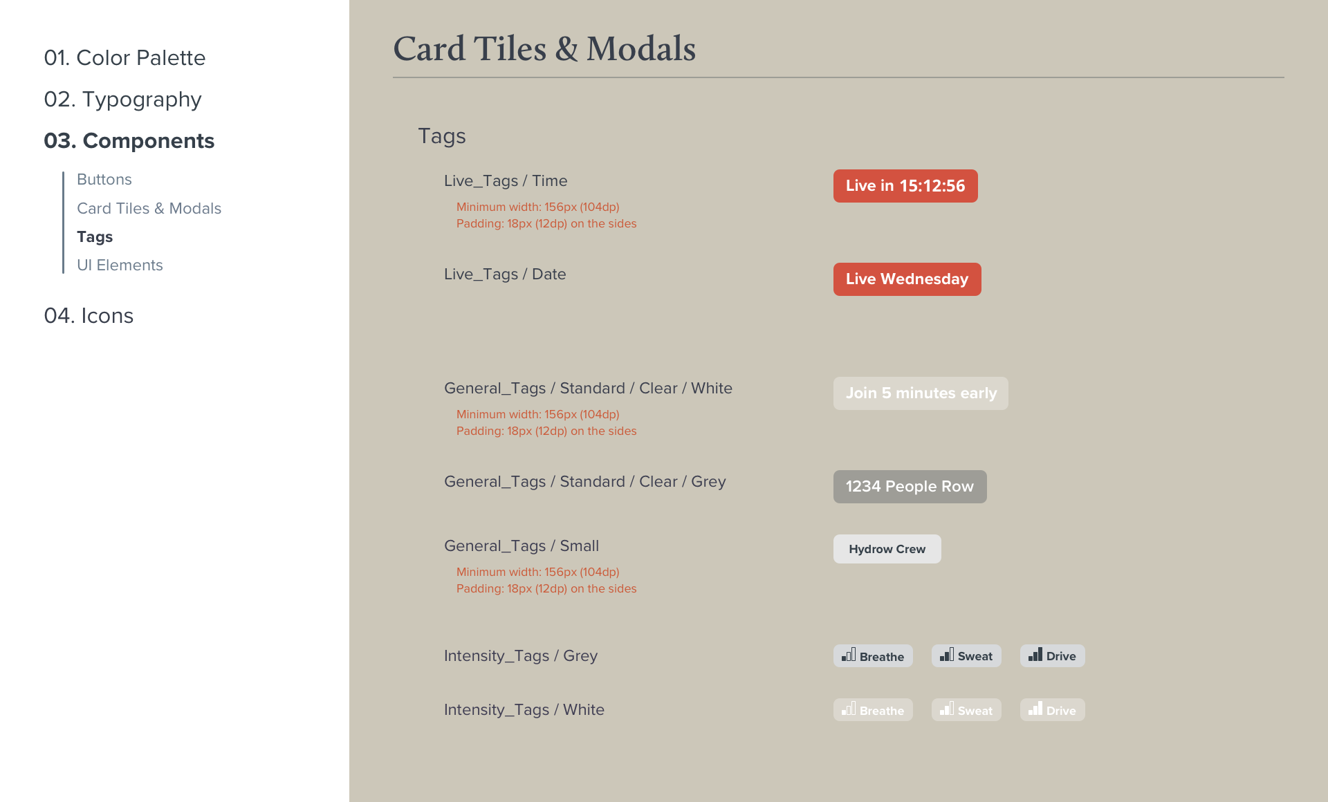
I audited the current designs from font types, colors, grid, elevation of drop shadow to interaction behaviors. The purpose was to pin point irregularities and inconsistency within our software.
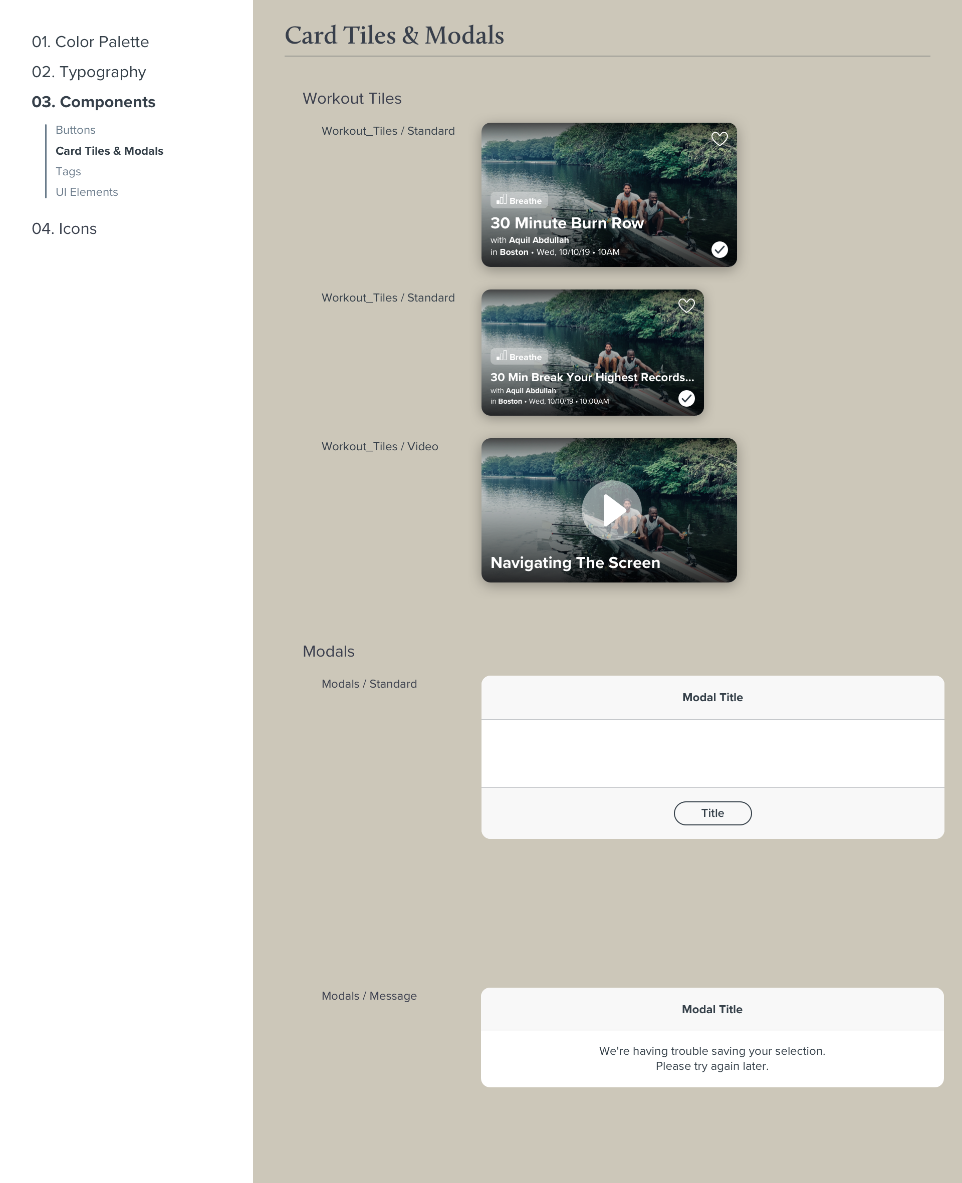
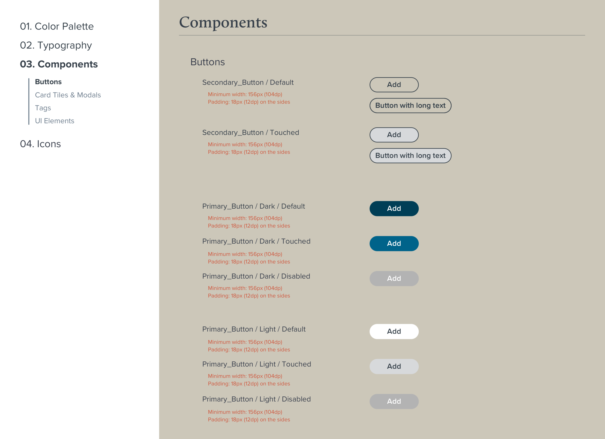
I then researched on current best practices across platforms and applied those onto the existing elements and patterns. We scheduled working session to brainstorm as a team to come up with standards and the foundation of the Design System.
We then put it down on writing in a Google Doc Form to make sure that every little detail is documented before creating the components on our Sketch file. This is just the ground work as we understand that this is an ongoing effort to keep creating and maintaining to keep a healthy and sustainable system.
© Jason Ma